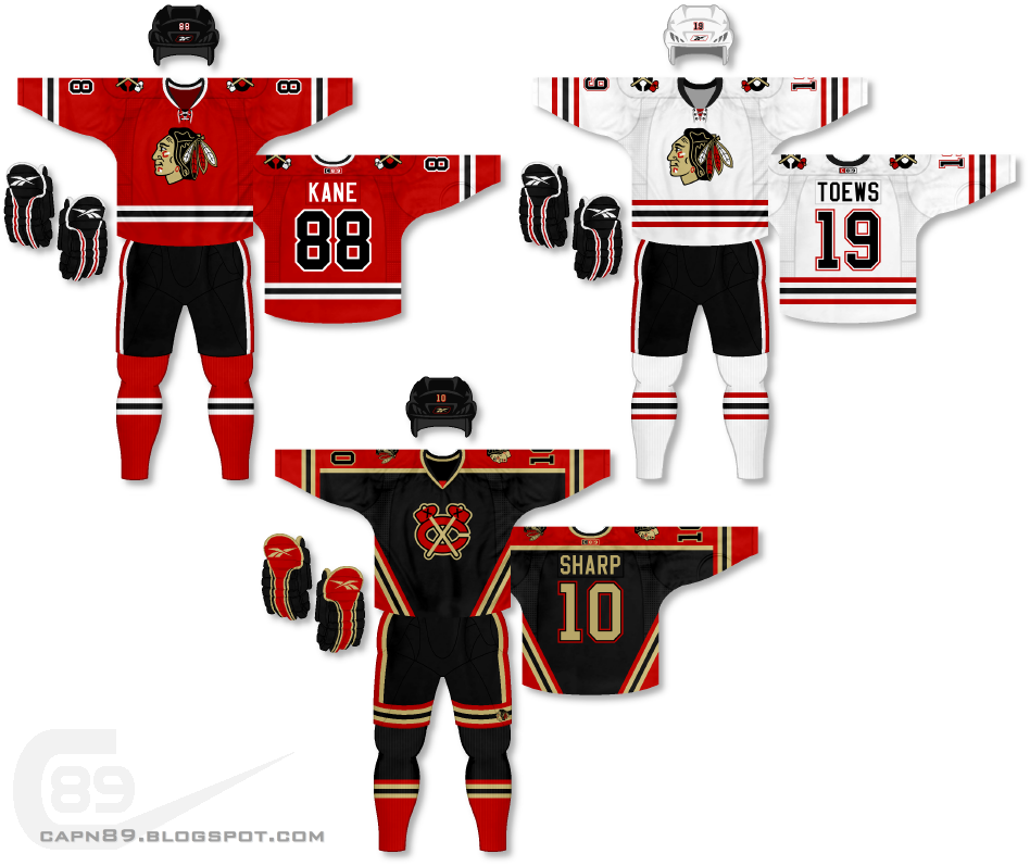
Another one of the original six, I present the first of two sets for the
Chicago Blackhawks.
Home & Away: A lot of original six traditionalists probably won't like these, but this series isn't about pleasing everyone, it's about changing up what already exists while still creating a good look. For starters the primary logo is completely recolored. While I do think the Blackhawks have one of THE best jerseys (the red one) in the NHL, I have never been all that big of a fan of the logo. I've always felt it had too many colors and felt "busy." That being said, the team is still named after an indian tribe so the logo needed to stay. I colored the face with a beige/tan color (seen on the alternate) and altered the hair, feathers and face paint to stick within a 4-color palette (red, black, white, tan). Both jerseys remain quite similar to what the team actually wears, save for minor changes. The striping on the red jersey is similar on the sleeves but lessened on the hem. The numbers are now black with white trim as opposed to white with black trim. The white jersey now mirrors the red jersey in that the black stripes are in the same location and the "extra" red stripes are basically where the red coloring begins on the home jersey. The white is, for the most part, a replication of the Blackhawks actual road jersey with the red and black stripes switched. For a team that favored such an abundance of red on its home jersey I always felt there was too much black on the road.
Alternate: The alternate is a re-imagining of a really old Blackhawks design I did. It features the primary jerseys' shoulder logo as the main crest as well as the elimination of white in favor of beige/tan.
Have a look and be sure to rate the set and leave some comments. Thanks.