Welcome to Icelines by capn89. On this blog you'll be able to view, rate and comment on all of my past, present and future hockey uniform designs.
I look forward to hearing from you. Enjoy!
Showing posts with label Anaheim Ducks. Show all posts

Monday, October 26, 2015

Post #60 - Anaheim Ducks - 2015

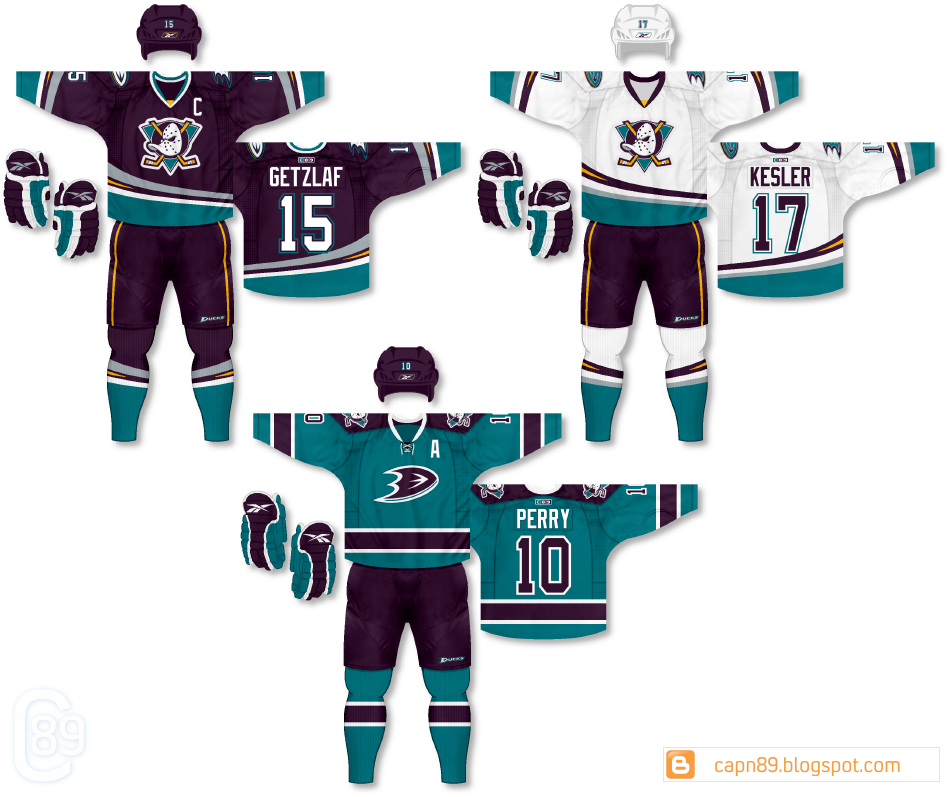
Here's my latest, the Anaheim Ducks.

Home & Away: For the primary jerseys I wanted to throw back to the original Mighty Ducks of Anaheim while still tying into the modern Ducks look. I slightly altered the original Ducks colors of eggplant and jade (adjusting the hues) to something I felt looked a bit better together. With this set I also wanted to attempt to bring yellow (seen on the sticks in the primary logo) into the overall look without making it muddled or overwhelming. The solution was using a touch of the color in the eggplant striping on the jerseys and socks, as well as the collar triangles and two thin stripes on the shorts. The uniforms also feature the current webbed "D" logo on the shoulders and "Ducks" on the shorts.

Alternate: I wanted the alternate to be very minimalist to contrast the style of the primaries. With that in mind I limited the colors to just eggplant, jade and white. The yellow and silver have been completely eliminated (save for altering the color of the sticks to silver on the shoulder logos).

Have a look and be sure to rate the set and leave some comments. Thanks.
Sunday, August 17, 2014

Post #44 - One-Off Fun #1 - Anaheim Ducks

Here are the Anaheim Ducks, the first post in a series of "One-Offs" for a variety of different teams. While some of them won't technically be single jerseys they are part of this series because they were not included in the original sets due to varying reasons.

Details: So if you checked out Part 1 of my Anaheim Ducks sets you probably notice that this jersey is the same template as the home (eggplant) and away (white) jerseys. This is a jade version that I debated using as either the primary or alternate and ultimately abandoned altogether.

Have a look and be sure to rate and comment. Thanks.

Friday, March 30, 2012

Post #8 - Anaheim Ducks Part 4 of 4

And we finally close out the Anaheim Ducks four part series.

Home & Away: The same uniforms and logos featured in part 3, though the colors are less "Mighty" and more "ducky." Basically I took the team's current color scheme and replaced black with green. The hockey pants are also striped differently.

Alternate: The same as the alternate in part 3, though colored to fit the scheme of the current set.

Have a look and be sure to rate the set and leave some comments. Thanks.

Post #7 - Anaheim Ducks Part 3 of 4

Part 3 of the Anaheim Ducks four-parter is here.

Home & Away: The "Mighty" colors and logos make another return, this time on a more traditional design. As well the home jersey is jade as opposed to eggplant.

Alternate: Basically the same jersey seen in part 1, with jade and eggplant swapping places.

Have a look and be sure to rate the set and leave some comments. Thanks.

Post #6 - Anaheim Ducks Part 2 of 4

Part two of the Anaheim Ducks four-part series is ready for your eyes.

Home & Away: The current logos and colors grace the previous "Mighty" design seen in part 1, although the circular logo makes a recolored return as a shoulder patch.

Alternate: Considerably similar to the alternate jersey seen in part one, though the striping features extra lines to account for the bronze color.

Have a look and be sure to rate the set and leave some comments. Thanks.
Post #5 - Anaheim Ducks Part 1 of 4

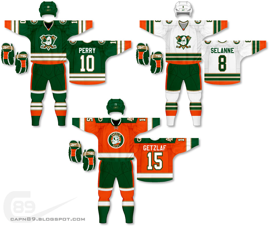
Welcome to the first of a four-part series for the Anaheim Ducks.

Home & Away: Oh so Mighty! The NHL has never seen a color combination like the old Mighty Ducks of Anaheim and their eggplant, jade and silver and it's something I wanted to bring back, even if only in digital form. The base jerseys feature modern side panels and traditional sleeve striping that plays off of the look of the panels. As well, the duck with crossed hockey sticks is back!

Alternate: I went with a decidedly simple look for the alternate jersey that features the traditional three-stripe design and a faux-back-esque circular logo. The shoulder "AD" logo is a nod to the Mighty Ducks "MD" logo.

Have a look and be sure to rate the set and leave some comments. Thanks.