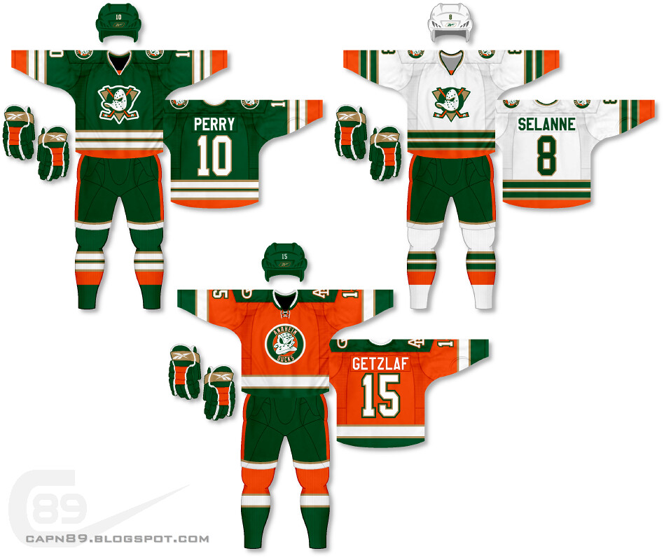
Home & Away: The same uniforms and logos featured in part 3, though the colors are less "Mighty" and more "ducky." Basically I took the team's current color scheme and replaced black with green. The hockey pants are also striped differently.
Alternate: The same as the alternate in part 3, though colored to fit the scheme of the current set.
Have a look and be sure to rate the set and leave some comments. Thanks.

No comments:
Post a Comment