Welcome to Icelines by capn89. On this blog you'll be able to view, rate and comment on all of my past, present and future hockey uniform designs.
I look forward to hearing from you. Enjoy!
Showing posts with label Minnesota Wild. Show all posts

Friday, March 15, 2024

Post #85 - Minnesota Wild "To The Stars"

This week's jerseys are another set for the Minnesota Wild.

YouTube

Home: Two versions of a very simple home jersey. Overall, while the green-shouldered version looks clean, I like the addition of red shoulders to really balance out the look. The "wild" pattern on the red stripes helps bring something special into the mix.


Away: In a similar sense to the home jerseys, while the white-shouldered jersey looks clean, the red shoulders add something I just can't put my finger on. Imagining these with green hockey pants I think the red shoulders would help to balance the mix of green, red and white.


Alternate Home & Away: I designed these quite some time ago (10 years to be exact, oof), and I gotta say, they look pretty nice on an updated template.


Friday, March 1, 2024

Post #84 - Minnesota Wild "Tradition & Craziness"

This week's jerseys are the Minnesota Wild.

YouTube

Home & Away: Up until the last 10 years or so I loved practically every Minnesota Wild jersey ever released. I wanted to keep the green-on-green look of the original jerseys while giving it a somewhat classic twist. As mentioned in a previous post, these designs come chock full of fine details that get lost at lower resolutions, but your keen eyes might notice the "wild" pattern on the green shoulders and stripes. I only watch KHL games these days and even managed to get my hands on a 2022 Kazan Ak Bars authenic home jersey and, despite all the awful ads all over the jerseys, they do a lot of really cool things with textures and embroidery. That was my inspiration for many of my design ideas.


Thirds: Two third jerseys in alternate colorschemes using a tried and true traditional style. The predominantly red jersey should be a permanant alternate jersey for the team. You know I'm right.


Altrnate 1: Getting Wild. Borrowing from the design of the two third jerseys, this sweater comes at you in vintage white, featuring the barely used "Wild" logo as a primary crest and the Minnesota "M" on the shoulders.


Altrnate 2: A super old Wild design of mine going way back, I've altered and modernized it on this new jersey template.


Friday, March 27, 2015

An Update

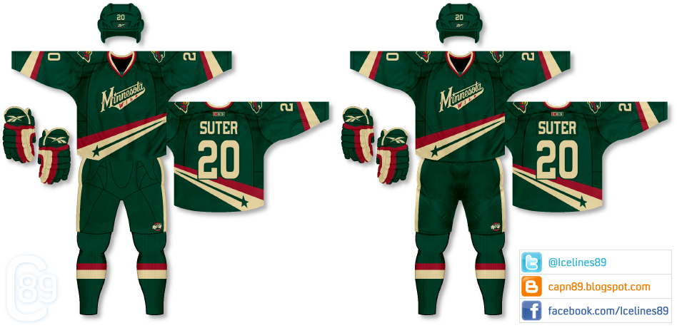
The blog is still going and I will have plenty of new content to come. I have been working on some ideas as well as tweaking the template texture for the pants. As a preview here is a before and after for the Minnesota Wild unused alternate I designed. As well as a more realistic texture on the pants I added some shadows to help distinguish uniform "parts;" jersey, pants, socks, etc.

Sunday, November 16, 2014

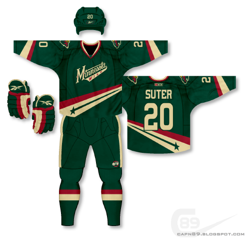
Post #52 - One-Off Fun #9 - Minnesota Wild

And now, the Minnesota Wild.

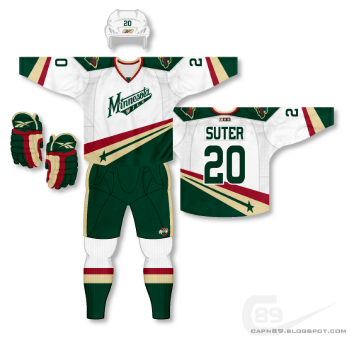
Details: I've decided to share two jerseys in this post since they are meant to go together and I feel it would be a waste to showcase them separately. The green jersey in this set was originally intended to be an alternate jersey for my original Wild set, but I didn't like the idea of having two primarily green jerseys, so I went with a red alternate. I liked the design so much that I decided to try making a white uniform to compliment it. Below is what I came up with.

Have a look and be sure to rate and comment. Thanks.

Monday, July 1, 2013

Post #20 - Minnesota Wild

Next up is set for the Minnesota Wild.

Home & Away: I've always been a big fan of the Minnesota Wild's inaugural jerseys. The green on green, the unique (at the time) striping and the overall aesthetic of those two uniforms was great. However, since the point of this series is to not repeat what has been done before but to create something new, I wanted to take that look and create something more cohesive while paying homage to that design. The Wild had such unique striping leading into their collar that I wanted to bring that back in the use of a traditional yoke rather than full-length sleeve stripes.

Alternate: This uniform features the "Minnesota" script (slightly altered) on a primarily red jersey as opposed to the green jersey it is currently used on. The pants remain the same from the base set, but the alternate is accompanied by a different set of gloves to tie into the overall uniformity.

Have a look and be sure to rate the set and leave some comments. Thanks.