Welcome to Icelines by capn89. On this blog you'll be able to view, rate and comment on all of my past, present and future hockey uniform designs.
I look forward to hearing from you. Enjoy!
Showing posts with label Colorado Avalanche. Show all posts

Friday, October 30, 2015

Post #65 - Colorado Avalanche - 2015 - Part 5 of 5

The final Colorado Avalanche uniforms from this latest grouping.

Home & Away: The same designs as part 2 in this latest grouping of Avs uniforms, only updated to darker colors.

Alternate: The same design as part 2 in this latest grouping of Avs uniforms, only updated to darker colors.

Have a look and be sure to rate the set and leave some comments. Thanks.

Thursday, October 29, 2015

Post #64 - Colorado Avalanche - 2015 - Part 4 of 5

This is part 4 for the Colorado Avalanche.

Home & Away: The same uniforms seen in part 1 of these latest Avs uniforms, however they sport new shorts with the 2015 alternate jersey logo on the right leg and the "C" logo from their 2015 Winter Classic jerseys as shoulder logos. The biggest change is the use of a darker burgundy and a darker blue.

Alternate: The same as seen in part 1, only changed to darker colors and featuring a new logo on the right leg of the shorts.

Have a look and be sure to rate the set and leave some comments. Thanks.
Wednesday, October 28, 2015

Post #63 - Colorado Avalanche - 2015 - Part 3 of 5

Here is part 3 for the Colorado Avalanche.

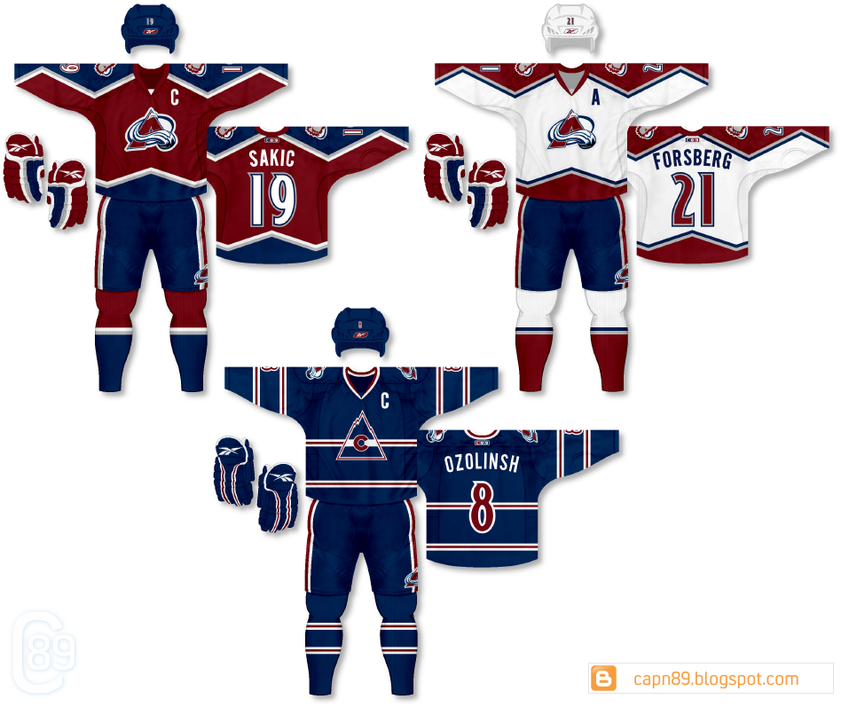
Home & Away: These are the same are the uniforms from part 2, however the pants are swapped from burgundy to blue, as is the home helmet.

Alternate: The same as part 2.

Have a look and be sure to rate the set and leave some comments. Thanks.

Post #62 - Colorado Avalanche - 2015 - Part 2 of 5

I present the second of five Colorado Avalanche uniforms.

Home & Away: Arguably the best look the Avalanche have ever had (their original look) I have re-imagined it by completely eliminating black from the design.

Alternate: An homage to the old Colorado Rockies, the alternate jersey features the retro logo on a completely new and unique design.

Have a look and be sure to rate the set and leave some comments. Thanks.

Tuesday, October 27, 2015

Post #61 - Colorado Avalanche - 2015 - Part 1 of 5

I have a bunch of tweaked and new jerseys coming for the Colorado Avalanche. Here is part 1.

Home & Away: The home and away jerseys are a rehash of an older Avalanche set of mine with a few alterations. The burgundy has been brightened and given more saturation, similar to the early color that Colorado used to wear. The number font has been changed from the typical style the team has been using since moving from Quebec. Lastly, the shorts now feature a logo on the right leg.

Alternate: The alternate is also a rehash of the previous design. The changes include the use of the brighter burgundy and completely new shorts in gray rather than blue. While many uniform aficionados find light-colored shorts to be a big "no-no" I feel they help balance the look better than blue or burgundy shorts.

Have a look and be sure to rate the set and leave some comments. Thanks.


Post #61 - Colorado Avalanche - 2015 - Part 1 of 5

Wednesday, November 12, 2014

Post #51 - One-Off Fun #8 - Chicago Blackhawks

Next up, I present the Colorado Avalanche.

Details: This uniform is the same design as the home & away jerseys from my initial Colorado set, with the primary difference being that burgundy and blue are swapped for each other. While I feel the uniform looks great on its own I could never quite come up with a design for a dark version that I though complimented it well enough.

Have a look and be sure to rate and comment. Thanks.

Tuesday, April 17, 2012

Post #13 - Colorado Avalanche

Today I have a set for the Colorado Avalanche.

Home & Away: The first thing I really wanted to do for the Avalanche was remove pretty much all traces of black in their uniforms (save for the black puck in the primary logo). I decided to use burgundy as the "dark" color and hence, after giving blue pants and helmets a shot, opted to use it instead. As for the design of the base jerseys themselves, I wanted to both pay homage to their inaugural jerseys with the jagged shoulder/sleeve design but also play off of the flow and waviness of the "A" logo.

Alternate: I gave burgundy pants and helmets a go with this uniform but just didn't like it, personally, as much as I like the design you see. The uniform, heavy in blue, features a "classic" design with a "Colorado" script and accents of burgundy and grey without a trace of white.

Have a look and be sure to rate the set and leave some comments. Thanks.