Welcome to Icelines by capn89. On this blog you'll be able to view, rate and comment on all of my past, present and future hockey uniform designs.
I look forward to hearing from you. Enjoy!
Showing posts with label Philadelphia Flyers. Show all posts

Friday, July 26, 2024

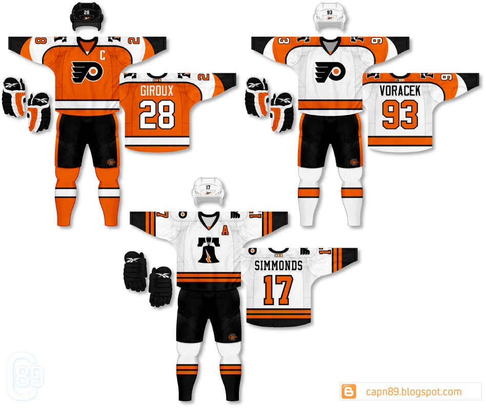
Post #92 - Philadelphia Flyers "Old Time Hockey"

Here's a second batch of jerseys for the Philadelphia Flyers.

YouTube

Home & Away: If you were a fan of the Flyers or just uniform design in general, you might recognize the striping on the home and away as being similar to the socks the team used to wear back in the 90s and early 2000s. I always disliked the way the socks never really matched the jerseys, but now you can imagine how they would.


Third: This third jersey is a twist on the orange alternate the Flyers introduced in 2002-thru-2007. The silver is removed and the sleeve striping and hem striping is altered. I also decided to go with a more rounded font for the numbers and letters.


Alternate Home & Away: These are alternate home and away Liberty Bell jerseys. They're styled on the previous set's orange alternate, which itself was styled on the short-lived Philadelphia Quakers jerseys.


Alternate: Lastly, a somewhat risky version of the black Flyers jerseys first introduced in 1997. The lower sleeve striping is altered and the hem of the jersey now has striping to accent the shoulders and sleeves. The numbering is stark black and white laid on their opposing colors while the bright orange name and captain's "C" stand out nicely on the black base.


Friday, July 12, 2024

Post #91 - Philadelphia Flyers "Orange & A New Black"

Here's a look at some designs for the Philadelphia Flyers.

YouTube

Home & Away: While similar in design to the Flyers traditional look, these jerseys feature alterations that give them new life. Firstly, there is a decided increase in the use of black, especially on the numbers and lettering. Both the home and away use black for the numbers and lettering, lending an interesting consistency to the pair. The black sleeve "cuffs" run much higher up the arm and, if you look closely, feature a winged design, black on black, that adds a subtle point of interest. Lastly, a Liberty Bell logo adorns the shoulders.


Third: If you're going to go full retard with a purely black and orange jersey, you may as well actually go full retard. This is me going full retard.


Alternate: An homage to the very old Philadelphia Quakers short-lived hockey franchise. Flyers-style.


Alternate: Do you remember the sock stripes from the late 90's/early 2000's black Flyers third jersey? Now those stripes are on a black jersey. It's as simple as that.


Alternate: This was a really old design of mine that I simply wanted to see mocked up on a modern template. There it is. The end.


Wednesday, March 25, 2020

Post #79 - A New View

Decided to mock up my Philadelphia Flyers on my brand new template. If anyone ever stops by, I hope you enjoy it.

High-Def view: HERE

Frickin' Awesome

Saturday, November 7, 2015

Post #69 - Philadelphia Flyers - 2015 - Part 4 of 4

I present the Philadelphia Flyers part 4 of 4, my favorite of my most recent Flyers sets.

Home & Away: I originally started these uniforms by creating an orange version where the white and black stripes were swapped, similar to the 90's era Flyers sock striping (which I plan to share in the future in my "One-Off Fun" series). While I thought it looked good there is something about having more black on this style of jersey that I felt put it over the top. I then added a matching white uniform and finished them off with traditional block numbers and letters.

Alternate: For this uniform I wanted to throwback to the much-maligned orange alternate that the Flyers debuted in the early 2000's, but see if I could give it a modern flair and actually make it look good.

Have a look and be sure to rate the set and leave some comments. Thanks.

Friday, November 6, 2015

Post #68 - Philadelphia Flyers - 2015 - Part 3 of 4

Here is part 3 of 4 for the Philadelphia Flyers.

Home & Away: These are basically the same uniforms seen in part 2, however the hem stripes have been removed and the uniforms have been refitted with completely new socks that mimic the sleeve striping.

Alternate:I toyed with many different versions of this uniform (black yoke, white yoke, black numbers, white numbers, orange nameplate, white nameplate, etc) and finally decided on this version. I felt that the logo was less "suffocated" by keeping the yoke the same color as the primary color of the uniform, but wanted to do something a little different on the back and made the nameplate black.

Have a look and be sure to rate the set and leave some comments. Thanks.

Thursday, November 5, 2015

Post #67 - Philadelphia Flyers - 2015 - Part 2 of 4

Here is part 2 of 4 for the Philadelphia Flyers.

Home & Away: If you click the Flyers logo on the right side of the screen and scroll down to the Flyers set I did in 2012 you will notice the similarities between those primary uniforms and these. These are an updated version with black outlines on some of the white areas of the uniform. I also added orange stripes to the sides of the shorts and removed the off-color nameplates. The shorts also feature a "Flyers" script on top of a dark Liberty Bell silhouette.

Alternate: This jersey is also a rehash of the alternate I did in 2012, however it is a primarily white version with the Liberty Bell logo as the primary rather than the "Flyers" script.

Have a look and be sure to rate the set and leave some comments. Thanks.

Wednesday, November 4, 2015

Post #66 - Philadelphia Flyers - 2015 - Part 1 of 4

After having not worked with the Philadelphia Flyers since 2012 I have four new sets, starting with this, part 1 of 4. I will be posting them in order of what I think is worst-to-best.

Home & Away: Easily the most "out there" design of all the sets that will be coming, the home and away uniforms feature a curvy and futuristic design that runs from the jersey to the shorts. I thought about keeping the shorts "normal" but I wanted to try something different (for better or worse) with the primary uniforms in this set. The numbers and letters are also a more non-traditional style, as well the orange color throughout the uniform is slightly darker than what you will see on the nine upcoming uniforms.

Alternate: A black uniform with a more traditional striping style and outfitted with a Liberty Bell primary logo. The fonts for the numbers and letters are also more traditional as well as the players' names being arched,

Have a look and be sure to rate the set and leave some comments. Thanks.

Friday, March 30, 2012

Post #4 - Philadelphia Flyers

Coming in at the 4th post we have my team, the Philadelphia Flyers.

Home & Away: The base jerseys don't stray too much from their current (2011-2012) uniforms, though they are, however, a mash-up of their current and former uniforms.

Alternate: The alternate features a retro-style design as well as "vintage white" in the stripes for the old-timey look. Much thanks to Ted Cunningham from Chris Creamer's Sports Logos message board for designing the "Flyers" script logo for me.

Have a look and be sure to rate the set and leave some comments. Thanks.