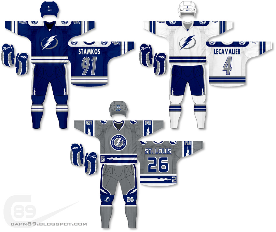
Home & Away: After their re-branding for the 2011-12 season, the Tampa Bay Lightning took a lot of flack for going with a "traditional" look to their uniforms, as well as simplifying from black/blue/silver/white to just blue and white. They also received criticism for "looking too much like the Toronto Maple Leafs" (another team that dons just blue and white in traditional striping. I personally welcomed the new look, but to satisfy both my preference and those of fellow hockey fans I decided to bring back silver, all the while keeping a somewhat traditional striping design.
Alternate: I decided to go a bit crazy for this one; a primarily silver jersey! Though the three-stripe design is what is generally considered to be "traditional" the addition of the streaking bolts, numbers on the left hem stripe, pants design as well as logo and number on the socks makes this one of the more futuristic jerseys so far.
Have a look and be sure to rate the set and leave some comments. Thanks.

No comments:
Post a Comment