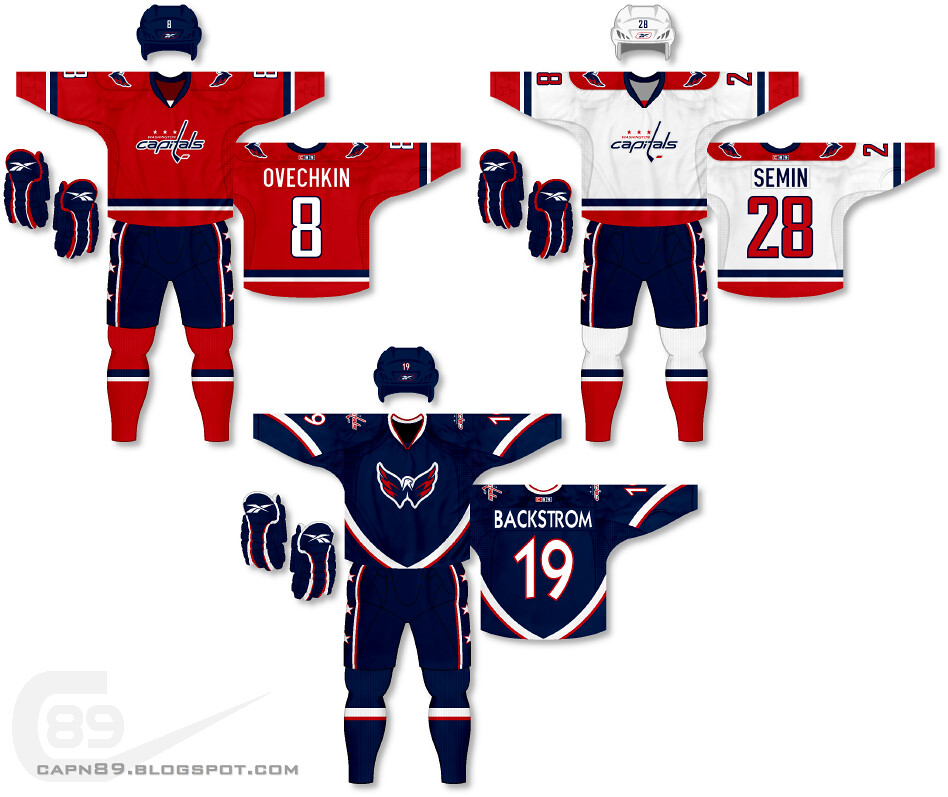
Home & Away: I wanted to go with something clean and classic for the Caps' base jerseys. The pants pay homage to their original style, though with a bolder, cleaner look. Also note, on the cuffs there is a subtle stitching of stars.
Alternate: As for the alternate, I went with a blue-heavy design with modern striping to play off the style of the "w-eagle." The name/numbers are more curvy and flowing to mesh with the uniforms overall look.
Have a look and be sure to rate the set and leave some comments. Thanks.

3 comments:
I really like the home and road jerseys, they look really clean and classy. I like the third too, but I think it could use a bit more red.
@Steven Grant, thanks for the comment. I actually have an alternate version of the alternate jersey where the red and white are swapped. After seeing that version and the current version with the rest of the set I felt the one I chose fit in better. I will, however, be posting the alternate version at some point in the future along with other uniforms I've come up with but didn't post. Thanks again.
I think your work is fantastic!
Would you be willing to help with a beer league design for a few bucks?
Best Regards,
George
twofoureight-417-185four
Post a Comment