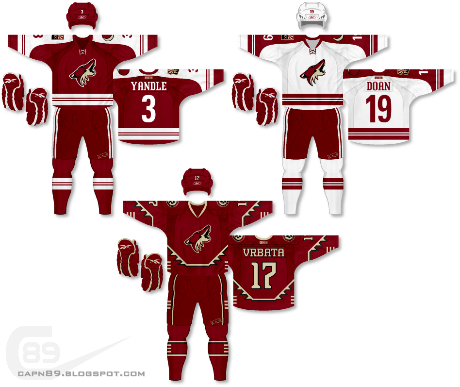
Home & Away: When the Coyotes switched from their unique uniform design several years ago I initially did not like the look, but it's grown on me to the point where it is now one of my favorites. Unfortunately when Reebok took over producing the jerseys they completely eliminated stripes from the bottom of the jerseys and created something slightly boring. While I could have just reproduced those uniforms, I wanted to change things completely. The design is something entirely new and never seen before for the Coyotes. The brink-on-white palette remains, but the pattern is completely different. Usually I don't like using two different logos on the shoulders but I wanted to use the "PHX" flag logo on one shoulder while placing the moon logo on the other so that it appears as if the primary coyote logo is howling up toward it. It is subtle, but there was intent.
Alternate: With this uniform I allowed myself to be inspired by Phoenix's original jerseys and come up with a motif that aimed to pay homage to the American southwest. This uniform eliminates white completely while introducing both black and sand into the color-scheme.
Have a look and be sure to rate the set and leave some comments. Thanks.

No comments:
Post a Comment