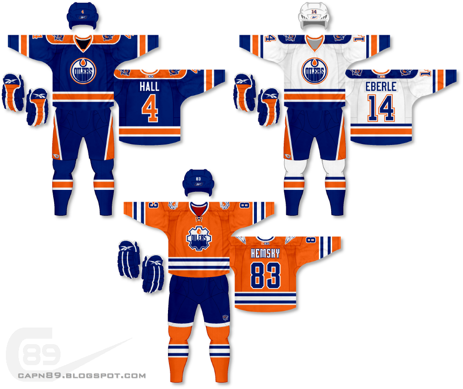
Home & Away: As has been the case with this series, I am trying to make every jersey for each team different from what they actually wear. Perhaps in the future I will do a little game of what I like best mixed with my own thoughts, but for now the goal is to design uniforms that are different from what the team currently uses, while still looking good. For the home and away jerseys in this set I really wanted to have big, bold stripes of orange to contrast with the oppression of the dark blue. I feel these two uniforms give a great balance of blue and orange as opposed to one color being overly dominant. I debated using orange numbers on the white jersey but ultimately I felt the blue looked best.
Alternate: With this jersey I used a custom logo as the primary crest that is a mix of the Oilers normal logo and the sprocket logo seen on their blue alternate jersey used between 2001-07. The sprocket logo from that jersey can be found, recolored, on the shoulders of this jersey as well as on the pants for the home and away.
Have a look and be sure to rate the set and leave some comments. Thanks.

No comments:
Post a Comment