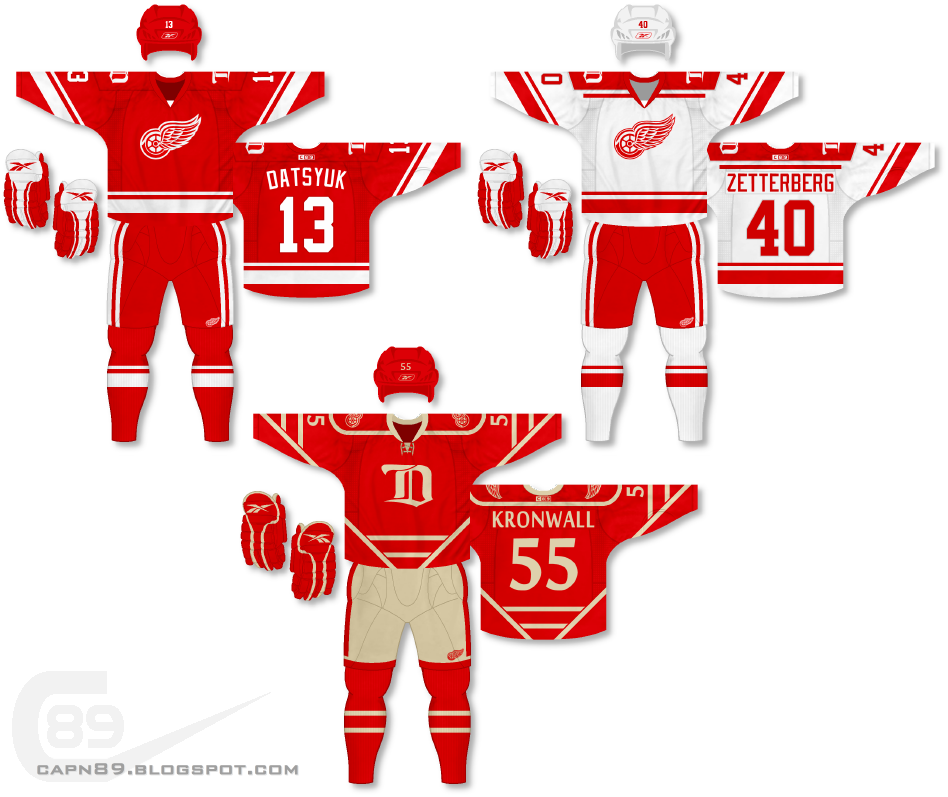
Home & Away: For the primary jerseys I decided to take the striping elements of the Redwings 2014 Winter Classic jerseys and use them to create two, completely new jerseys. On the home, red jersey the numbers honor the actually Redwings jerseys with the arched names on the back, while the road, white jersey features a nameplate with a straight name under the shoulder stripes. For the keen-eyed out there you might also notice that the winged-wheel logo has been modified and modernized from their actual logo. While the Redwings' logo is a classic, I felt it could keep its look and feel while still getting some slight alterations.
Alternate: The alternate jersey is a really, really old design of mine. So old, in fact, that I originally created it during the BFBS (black for black's sake) era of uniform design. In fact, the original version of this was used as a home and away and featured red, white, black and silver! (At some point I will mock up the original on my new template and share it.) This incarnation is decidedly less busy, only using red and vintage white. The pants, also vintage white, are used as both a throwback to the old days of hockey as well as an element to break up all of the red in the uniform.
Have a look and be sure to rate the set and leave some comments. Thanks.

No comments:
Post a Comment