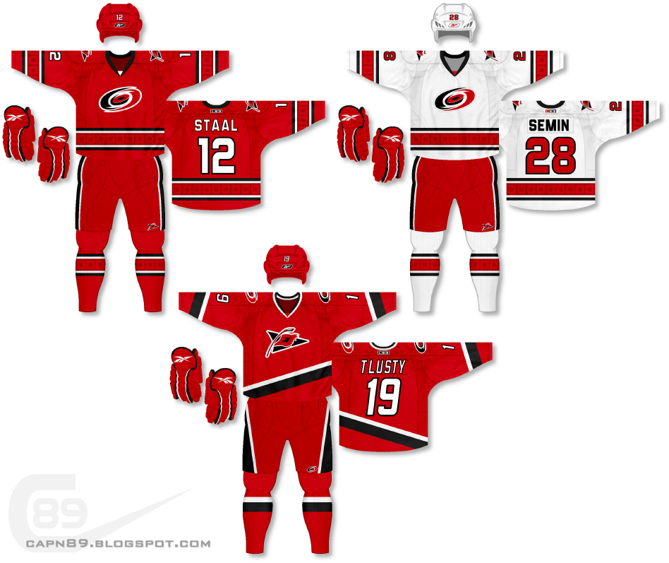
Home & Away: Since the Hurricanes recently revealed their new uniforms to less-than-spectacular fanfare, I decided to try to stick with elements of their latest threads and put, what I feel, is a better spin on it. To start, I actually liked the look of the white away jersey, but it does leave something a little "Hurricane-esque" to be desired. I made a home uniform based off of the white and both jerseys feature the warning flag logo on the shoulders as well as what I like to call a "subtle homage" to the warning flag stripe that used to adorn Carolina's jerseys. The pattern also appears on the socks. The subtlety of it keeps the Hurricanes both more traditional yet unique. Also, other tweaks involve the removal of silver and an adjustment to the primary logo. Anyone who's ever taken a look at the Hurricane's logo would notice that the eye/puck in the middle seemed to be upside down. That is rectified by simply rotating the logo 180 degrees and swapping the black and red.
Alternate: For this jersey I wanted to use the warning flag logo's angle as inspiration for the jersey's striping. The hem stripe follows the line of the primary logo while the sleeves and pants feature angular designs.
Have a look and be sure to rate the set and leave some comments. Thanks.
No comments:
Post a Comment