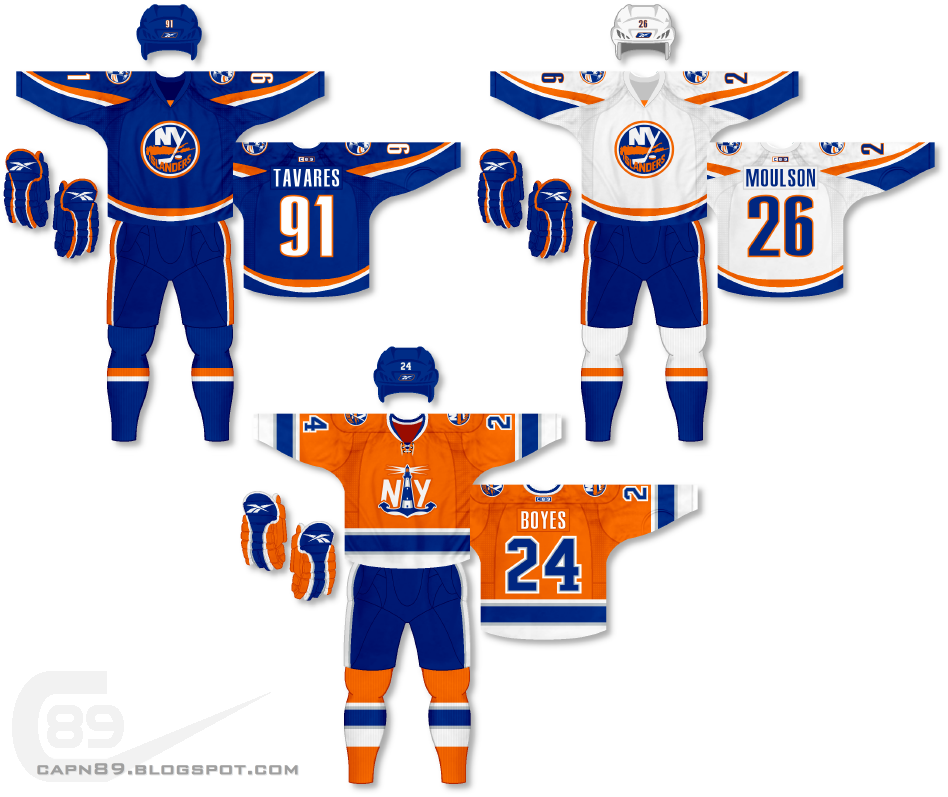
Home & Away: The primary jerseys are a previous design of mine that I'd made for the Islanders but with this latest incarnation I changed up the hem striping a bit so that it actually connects all the way around instead of, as before, it getting cut off by side panels. The primary logo is the same, just some of the outer rings swapped colors. The shoulder patch is a cleaned up and altered version of the lighthouse logo from the fisherman jersey era. Have a look:

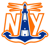
Alternate: For the alternate I was originally going to slap the touched-up lighthouse logo on there but decided I wanted to try my hand at actually creating something different and unique for an alternate jersey. I've seen similar logos to what I came up with around the internet but basically it is a stylized boat anchor that turns into a lighthouse with "NY" on either side of it and, if you will, the lighthouse acting as an "I" for Islanders. The bottom of the anchor is also meant to mimic a ship cutting through the water. Here's the logo:

I also changed up the gloves and pants from the primary set. I initially went with the same as the home and away but after swapping them out for what you actually see it made a world of difference and really brought the uniform together.
Have a look and be sure to rate the set and leave some comments. Thanks.

No comments:
Post a Comment