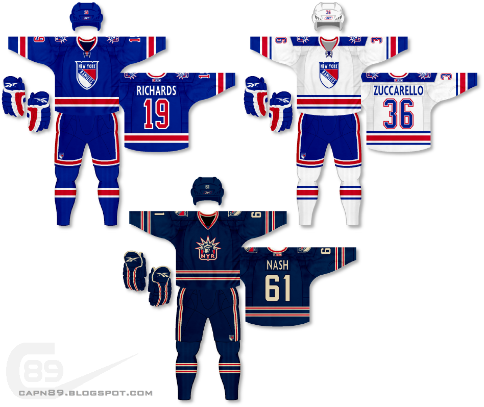
Home & Away: For these uniforms I wanted to keep a traditional feel to the overall look, all the while addressing some issues I personally have with the Rangers uniforms. For starters, I have never been a huge fan of the slanted "RANGERS" script on the front of the jerseys, though I do respect the history it has with the team. Nevertheless, gone is the script and in is a recolored version of the Winter Classic logo the team wore in the 2011-12 season against the Philadelphia Flyers. Logos, to me, are much more striking and I feel it is a change the Rangers could use. A recolored Lady Liberty patch, featuring an updated NYC font to match the primary crest, can be found on the shoulders. Also gone are the drop shadow numbers and the name plates now use a font that matches the primary logo. The striping on the jerseys is also virtually identical, with the red stripe being the same width and in the same location on both jerseys. The "extra" striping on the away jersey is simply blue carried over from the home jersey.
Alternate: The alternate's color scheme is taken, again, from the 2011-12 Rangers Winter Classic jersey, featuring a darker blue, red and off-white/wheat color. The primary uniforms' logo is now on the shoulders while the NYC Lady Liberty logo, recolored, adorns the front of the jersey.
Have a look and be sure to rate the set and leave some comments. Thanks.

No comments:
Post a Comment