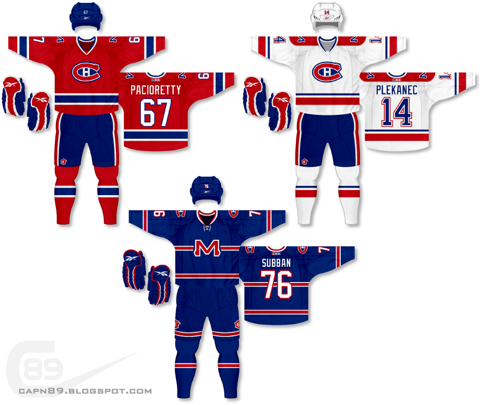
Home & Away: When it comes to hockey, most fans think it's sacrilegious to mess with the original six, and of those six teams the Montreal Canadiens are probably right there at the top of the list. However, I feel even they aren't perfect. Specifically speaking, their lack of continuity between their home and away jerseys has always irked me. Though I do like their home red jersey, for the sake of this project as well as for sticking closer cohesiveness, I have altered the home jersey. The bold blue stripes contrasted by white still remain, but the large torso stripe has been removed and replaced with striping on the jersey hem to match the sleeves. The away jersey has been altered drastically as I felt it needed red to dominate the color scheme as opposed to almost equal amounts of red and blue. The shoulders feature a stylized "M" logo in a similar look to the primary logo. A recolored logo that the Canadiens used on their 2009-10 throwback jerseys adorns the pants.
Alternate: For the alternate I wanted to pay somewhat of an homage to the Canadiens actual red jerseys, but blue, by creating a jersey that uses a logo over top a horizontal stripe that stretches across the chest. The stripe is much smaller than that of the actual Canadiens red jersey but I mirror it in all the other aspects of the uniforms striping. The "M" logo from the shoulders of the home and away is now front and center, and the throwback logo is now presented on both sides of the pants as opposed to neaer to the front.
Have a look and be sure to rate the set and leave some comments. Thanks.

No comments:
Post a Comment