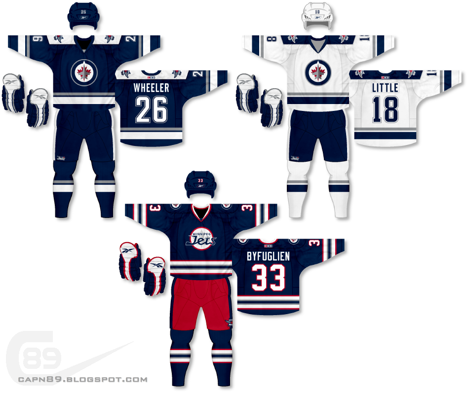
Home & Away: For the primary jerseys in this set I wanted to go with something simple and classy. Keeping with the Jets minimalistic use of red, the jerseys are predominantly blue, white and gray. I toyed with using red outside of just the logos, within the striping, and everything I tried only made the jerseys look like a muddled mess.
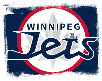
Alternate: With the alternate jersey, my primary goal was to find a way to mash-up the original Winnipeg Jets with their modern counterpart. In doing so I decided that creating a logo using elements of both eras would be the best place to start. The logo harkens back to the original Jets' roundel logo with "Winnipeg" appearing above a stylized "Jets" wordmark where the "J" represents a hockey stick. In the original logo a jet appears to the left of the "J" hockey stick, in my design I used the new jet design as the cross of the "T." As well I have included a gray/silver maple leaf, subtly, as a backdrop to the entire logo. As for the uniform itself, it is also a mix of old and new as the design takes the old jets uniforms and gives them a modern touch.

Have a look and be sure to rate the set and leave some comments. Thanks.

No comments:
Post a Comment