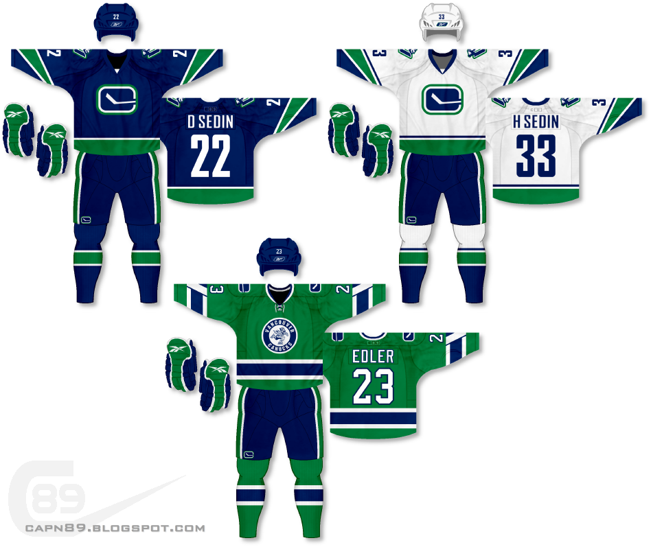
Home & Away: For the primary jerseys in this set I decided to get rid of the orca logo that has been used as the primary crest since 1997 and replace it with the modern version of the "C" stick-in-rink logo. The shoulders of the jerseys also feature the Johnny Canuck "V" logo. The design of the jerseys themselves, while simple, is meant to pay homage to the "V" sleeve striping pattern that has been seen in various incarnations on many of the Canucks jerseys throughout the decades.
Alternate: This uniform, in design, is meant to throwback to the original Canucks uniforms, though with the primary color being green rather than blue. The original stick-in-rink logo has now been replaced with a new roundel logo featuring an old school Johnny Canuck.
Have a look and be sure to rate the set and leave some comments. Thanks.

No comments:
Post a Comment