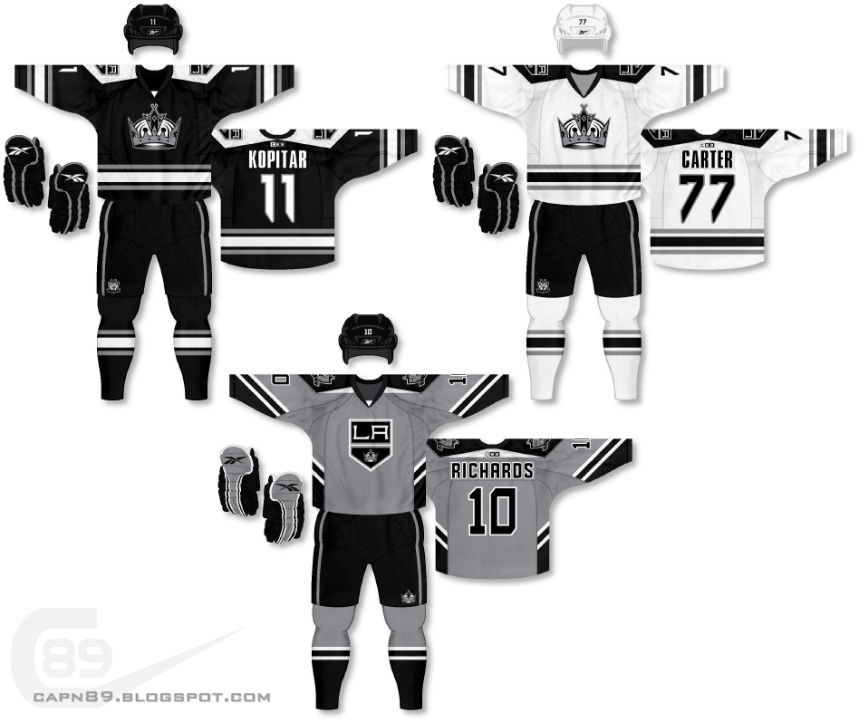
Home & Away: The primary jerseys, stylistically, are nothing outside of the box; a simple, three-stripe arm and hem design with a modern twist in the look of the shoulder yoke. I haven't been a huge fan of the Kings' current primary logo, so on this set it has been relegated to a secondary logo on the main uniforms.
Alternate: This jersey is an updated/tweaked version of an older design of mine for the Kings. Originally the design was primarily black with white, silver and purple accents, and it featured the crossed hockey sticks shield logo. I think this new take on the design comes off a lot cleaner. The shoulder yoke is a modified version of that seen on the primary jerseys and the "LA" banner logo is now the primary crest.
Have a look and be sure to rate the set and leave some comments. Thanks.

No comments:
Post a Comment