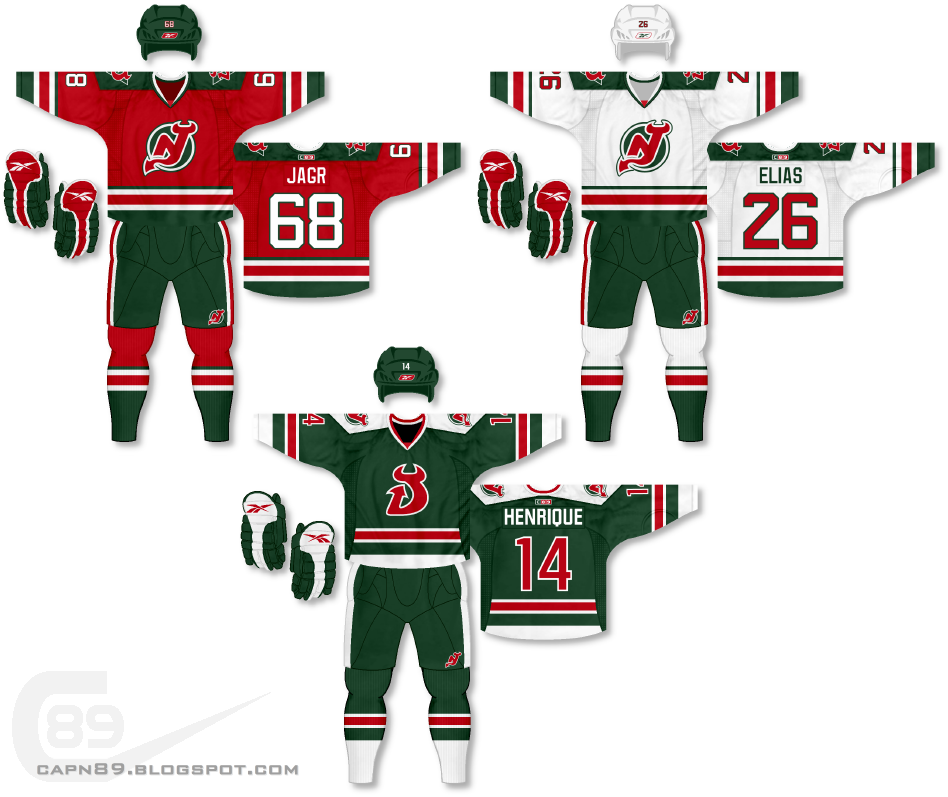
Home & Away: The primary jerseys in this set have a more traditional hockey feel to them. I also kept black out of the color scheme in favor of green. The primary logo, while slightly altered, is the same as on the first set.
Alternate: The alternate, once again green, sports the red "D" logo with a completely different design from set 1. The side-panel mesh is completely unique to any template out there, while the shoulders are the more angular design that I first used with the Kings.
Have a look and be sure to rate the set and leave some comments. Thanks.

No comments:
Post a Comment