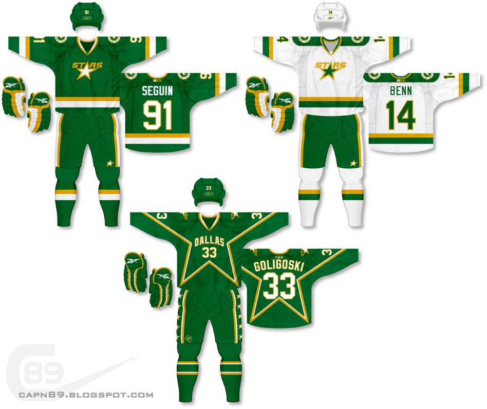
Home & Away: This year the Dallas Stars rebranded themselves with new logos and a new color scheme of white, green and black. While silver is in their scheme, it only makes an appearance in their logos. While I actually do like the new look of the Stars (though their previous set left a lot to be desired), I wanted to bring the Stars back to their origins with primarily green, gold and white jerseys. The primary jerseys are an incredibly simplistic design of big, bold stripes on the sleeves and hem. The previous Stars logo (save for "DALLAS") acts as the main crest while an altered version of their new roundel logo adorns the shoulders.
Alternate: Starting in 1997 (and through 2006) the Stars introduced a star-themed template that I have decided to bring back in my own way. The "DALLAS" wordmark (seen on their 2007-13 jerseys) now becomes the primary mark on the front of the jersey, just above the player's number.
Have a look and be sure to rate the set and leave some comments. Thanks.

No comments:
Post a Comment